- Home
- Circular Flow Diagram
- Gini-coefficient

The Gini Coefficient, Index & Inequality, Explained (with Graphs)
There are some misleading tables of information on some sites showing that the global Gini Coefficient has gotten steadily worse for the last 200 years and that world income inequality has worsened. You could easily conclude that the old platitude that the rich are getting richer and the poor are getting poorer is true, but I'd advise caution there.
World inequality has indeed increased over the last 200 years, but only because some countries have gotten rich whilst others remain poor, this is very different to the usual assumption that individual people within countries are steadily amassing all the goodies for themselves. Then again, that kind of inequality can happen, and it certainly has happened in recent decades, but the question is why and will it continue?
On this page I'll be discussing in some detail the broad picture of income inequality, how it is measured, where it is a problem, where it is not a problem, and whether improvements can be expected. I'll also address a few limitations of the Gini Coefficient as a measure of inequality.
What is a Good Gini Coefficient?
The Gini Coefficient is a statistical measure used by economists and other analysts to summarize the level of economic inequality in a country both at a specific point in time and across time-periods. It is usually used to look at household income distribution but it can also be used to look at other metrics, wealth inequality being the main alternative.
The difference between income and wealth is that the former is a flow concept i.e. usually it means how much money is earned over a month or a year. Wealth on the other hand is a stock concept i.e. a person's total net worth at a given time.
This sort of data is critical for anyone interested or involved in policy formulation aimed at improving the quality of life for the citizens of a country, and the Gini Coefficient gives a single point of reference for such things. A single point of reference is needed if useful comparisons are to be drawn across time and across international borders.
You'll sometimes hear the Gini Coefficient being referred to by other names such as the Gini Index or the Gini Ratio, but these terms all mean the same thing and can be used interchangeably. The measure is named after its inventor Corrado Gini, an Italian statistician of the early 20th century, and it is pronounced as in the Genie of Aladdin's Lamp.
There are, of course, many alternative measures of inequality each with their own merits. Most of them are much more specific in their measures e.g. a comparison of the richest 10 percent of earners compared to the poorest 10 percent, sometimes called the 90:10 ratio, or the Palma ratio which looks at the richest 10 percent compared to the poorest 40 percent. Whilst useful, as an inequality measure these ratios are not as comprehensive.
A score under 0.25 is a good Gini Coefficient, and represents a relatively equal distribution of income. As a visual aid to picture how household income inequality is measured, the 'Lorenz Curve' and the 'Line of Equality' are useful.
The Lorenz Curve & Gini Coefficient Graph
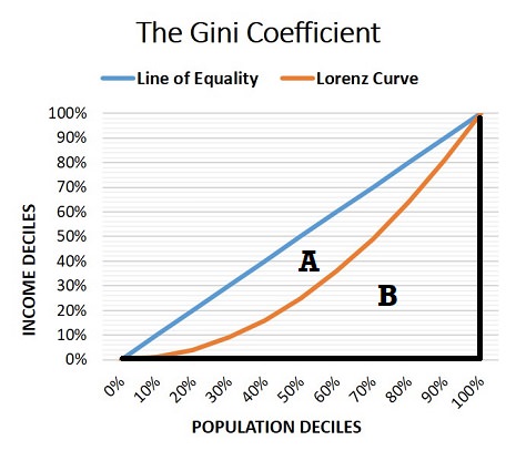
In order to understand the coefficient we can use a simple Lorenz curve, named after its inventor Max Lorenz, to illustrate the concept. In the graph below, the straight upward-sloping blue line is called the line of equality because it represents a fully equal income distribution.
Along the line of equality you can see that each population decile accounts for the same income decile e.g. the poorest 30% of the population accounts for 30% of the income, the poorest 70% of the population accounts for 70% of the income, and so on. So the line represents perfect income equality.
In reality, complete equality is impossible, so the bowed Lorenz curve is appropriate.
In the graph, this particular Lorenz curve estimates that the poorest 30% of the population accounts for approximately 10% of the income. The more bowed that the Lorenz curve gets, the more unequal the distribution of income.

The Gini Coefficient Formula
The Gini Coefficient Formula gives a numerical value to the level of inequality depending on how bowed the Lorenz curve is. Imagine that the area under the Line of Equality is equal to 1, (i.e. A+B=1).
The more unequal that the income distribution gets, the more bowed the Lorenz curve will be, and the bigger that area A will be. Clearly the Gini Coefficient range must equal an amount between zero and one. For most countries the true value usually lies somewhere between 0.2 and 0.4.
Gini Coefficient Formula = A / (A+B)
A top income inequality score of 1 would represent perfect inequality, where one person (or household) makes all the income. A score of 0 represents absolute equality, where the poorest individual (or household) makes as much as the richest person.
In many ways the most interesting question relates not so much to what the number is at any given time, but how it is changing over time, because that tells us whether we have rising inequality or not.
So, let's turn to the historical trends.
The Gini Coefficient by country, over time
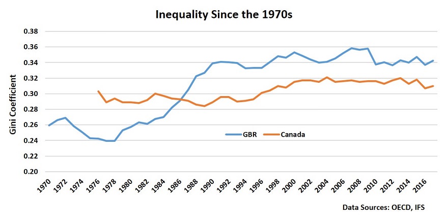
Historical trends for the Gini Coefficients by country are largely unavailable, but there is a limited data set for a few countries that goes back to the late 60s or early 70s. In the graph below I've plotted the information available for Great Britain and for Canada.
The data presents a tale of two countries:
- Great Britain experienced a major rising inequality that started in the 1980s and lasted for a decade. Since that time the level of inequality has stabilized, but at a higher rate.
- Canada, during the 1980s, experienced no growth in inequality at all, and only moderate growth during the 1990s after which time it too stabilized.
You can see that Great Britain, starting from a position of less inequality than Canada, has undergone some major changes to the distribution of income in its society, so much so that it has become significantly more unequal than Canada.

Gini Coefficients for the USA are a little patchy, but there is some data available from the World Bank that shows a very similar general pattern, i.e. inequality climbed throughout the 1980s and into the mid 1990s where it leveled off, the climb was not as steep as that of Great Britain, but the US started from a high level to begin with. It has also been relatively stable since the mid 1990s right through to the current time.
The important question relates to what exactly has driven these changes.
1980s Income Inequality & Deindustrialization
The process of deindustrialization occurs naturally as an economy develops, but that process may have been sped up during the 1980s and early 1990s enough to make a very noticeable impact on inequality levels at that time. The UK alone witnessed the loss of over 3 million jobs in traditional manufacturing industries during this period, and the same forces that drove UK job losses were also working throughout the developed world, albeit to a greater or lesser extent.
The process of growth from a poor, poverty ridden subsistence economy, to a modern fully developed economy begins with a move from employment in agriculture towards manufacturing and other production industries. According to Engel’s Law, as total income levels rise people start to spend a growing cumulative proportion of their money on products other than food. Food has a low income elasticity of demand.
Once basic food and shelter needs are catered for, people tend to spend more on household goods and appliances like refrigerators, washing machines, cookers & ovens, furniture and so on. This drives the growth of industries that produce these goods, as well as growth in industries that produce the necessary raw materials and tools to make them.
In addition, as a country develops, agriculture becomes more mechanized and thereby requires fewer employees.
As development continues, the country will trade a higher and higher proportion of its goods with other countries, and consumption expenditure on ever more luxury goods will increase. At the same time, demand for basic service products like cleaners, repair shops, babysitters, restaurants, hotels, retail and wholesale outlets and so on, takes off.
Whilst all this is happening disposable income increases exponentially, and soon the country finds that all but its most high-tech manufacturing industries (which require highly skilled operatives) starts to lose competitiveness to cheaper foreign producers and, consequently, imported goods rise rapidly. Manufacturers of basic goods like clothing, footwear, linens, tools, and so on are forced to relocate to foreign shores where the labor costs are lower.
As with the agricultural sector before it, manufacturing and associated industries start to become heavily mechanized with advanced robotics, and fewer employees are required to produce increasing amounts of output.
By this time there is a growing service sector in highly skilled occupations like accountants, financial advisors, doctors, lawyers, bankers, educators, architects, engineers, business consultants, programmers, brokers, researchers, investment analyst experts and so on. So, as manufacturing sheds workers, the service sector increases its share of total employment because it is not so easily mechanized.
In short, as an economy develops from a subsistence economy, most of its industries and jobs will move first from agriculture towards manufacturing and basic service industries. As national income rises, employment gravitates towards more high-skill occupations in service based industries, and away from traditional manufacturing, whilst retaining a smaller number of workers employed in high-tech manufacturing and advanced engineering.
The relevant point here is that these transition phases can lead to a loss of employment for some people, particularly the low-skilled or those with antiquated skills, and that can lead to significant and lasting levels of poverty as household income falls for those families with newly redundant workers. The 1980s in particular generated this type of income inequality in many developed economies.
1979 OPEC Oil Price Rise
The 1979 OPEC oil price rise acted as the catalyst for the sharp transition of employment away from traditional manufacturing and its support industries in the 1980s. Oil was an even more important factor in overall costs of production in the developed world during this period than it is today, and when the oil price doubled in 1979, it impacted a huge number of industries.
The effect of this was to create a permanent contraction of long-run aggregate supply, which in turn meant that cyclical unemployment increased as output was reduced and prices rose. Some countries were affected more than others, some were affected more immediately than others, but very few managed to escape major trauma.

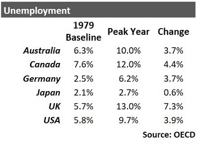
As the table shows, the major economies were impacted quite heavily with the peak year for unemployment anywhere from 1982 to 1985. Of the countries listed, only Japan escaped a serious economic downturn.
It is interesting to note that both Japan and Germany (the two countries most rebuilt and modernized after WW2) performed relatively better over the period with lower unemployment levels overall.
This may indicate that most of the traditional manufacturing industries in these two countries had already disappeared by the time that the oil price rises hit, and that they were therefore relatively better prepared to deal with it.
The United Kingdom, on the other hand, seems to have been hit significantly harder than its competitors, and major deindustrialization did occur there at this time. This may be one of the main reasons why the Gini Coefficient increased for the UK so much faster than, for example, Canada (as illustrated in the earlier graph).
Do rich countries have more inequality?
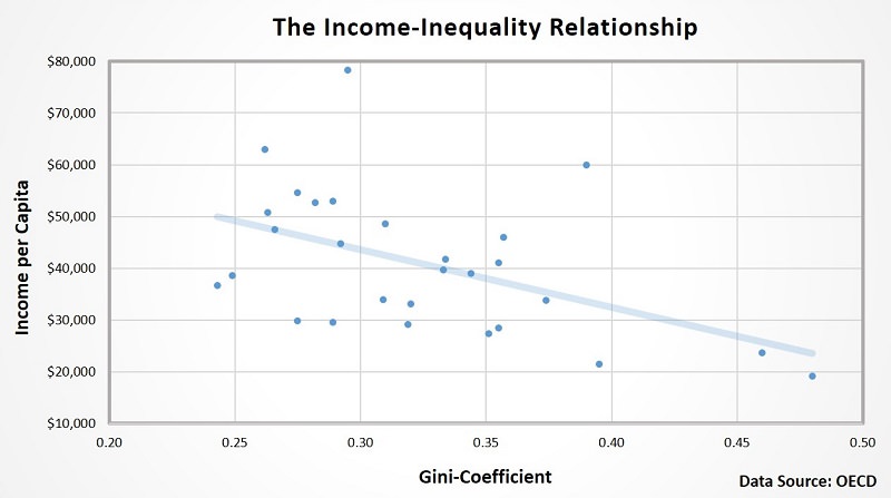
With regard to the opening statements on this page about how world income inequality is not really increasing in any harmful sense, I thought that a little more economic evidence might help at this point. In the graph below I have plotted data on two variables, income per capita in US dollars, and the Gini Coefficient.

Each dot in the diagram represents a country, and the inverse relationship between income per capita relative to income inequality is clear. Countries DO NOT become more unequal in terms of income distribution as their economies get richer, they actually get more equal. As a result, as global GDP increases the world income distribution is becoming more equal.
This is not to say that each passing day brings more equality, and as I've described on this page there may be periods of decades where inequality increases. However, it is important to keep an eye on the big picture here, and not assume that there is some master plan for the elites in society to impoverish the masses as GDP grows, no one is trying to do that.
With that said, I do believe that there is work to be done to lower the coefficient and create a more equitable distribution of wealth within our societies.
Limitations of the Gini Index Data
The main limitation of the Gini Index is that it says nothing about the way in which the Lorenz curve is bowed, i.e. is it bowed more at lower incomes or at higher incomes. If the former then there may be significant extra difficulties for the poorest people in society than is suggested by Gini Coefficients.
This is a fair criticism, but no single point of data can capture all features of a complex problem such as inequality. The standard response here would be to complement the coefficient with other, more specific statistics, to get a fuller picture. The 90:10 ratio and the Palma ratio can help with this
Another limitation arises from the fact Gini Coefficients are usually collated at the level of the household rather than the individual. This is a problem when the changing composition of household members distorts the statistics e.g. a household with multiple income earners may appear to be wealthy, but what if it is a household full of people who cannot afford their own homes - a small rise in incomes for these inhabitants might result in multiple households each with a single low income occupant. That would increase the coefficient even though real inequality had been reduced.
This reflects real world developments in many countries, with more multiple income households as well as more zero-income households (lone parent households etc) than in previous decades.
Data Sources:
Related Pages:
About the Author
Steve Bain is an economics writer and analyst with a BSc in Economics and experience in regional economic development for UK local government agencies. He explains economic theory and policy through clear, accessible writing informed by both academic training and real-world work.
Read Steve’s full bio
Recent Articles
-
What Happens to House Prices in a Recession?
Jan 11, 26 03:13 AM
What happens to house prices in a recession? Learn how different recessions affect housing, why 2008 was unique, and how policy responses change home values. -
Does Government Spending Cause Inflation?
Jan 10, 26 06:01 AM
Does government spending cause inflation? See how waste, crowding out, and stimulus spending quietly push prices higher over time. -
What Happens to Interest Rates During a Recession
Jan 08, 26 05:31 PM
What happens to interest rates during a recession? Explore why rates often fall, when they don’t, and how inflation, policy, and markets interact. -
Circular Flow Diagram in Economics: How Money Flows
Jan 03, 26 04:57 AM
See how money flows through the economy using the circular flow diagram, and how spending, saving, and policy shape real economic outcomes. -
What Happens to House Prices During Stagflation?
Jan 02, 26 09:39 AM
Discover how house prices and real estate behave during stagflation, with historical examples and key factors shaping the housing market.