- Home
- Cyclical Unemployment
- Phillips Curve

Phillips Curve Explained (Graphs & Real World Examples)
The Phillips curve is a tool that economists use in their models of inflation and unemployment. It has been around since the late 1950s but has undergone significant development and adaptation over the years. In a nutshell, it depicts the inverse relationship between inflation and unemployment.
The concept remains in use at the current time, although recent decades have blurred the relationship somewhat, particularly when considering a time-frame of more than a few years.
On this page I will explain how the theory behind the Phillips curve was developed as well as some problems and mistakes that are associated with it. I will show that the inverse relationship between unemployment and inflation that was once clear to see is now not so easy, and I will show that one cause of this may be due to the effects of globalization, or rather the effect of globalization on the Consumer Price Index (CPI) measure that we use as the standard for international comparison.
The Short-Run Phillips Curve
The short-run Phillips curve displays the classic trade-off between inflation and unemployment that the model is known for. The numbers in the diagram are arbitrary, but they show how the trade-off works.
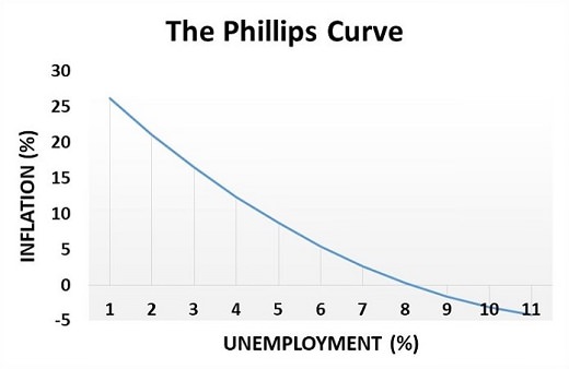
In the diagram I've also included a portion of the curve that dips below zero inflation and into deflation. Deflation is rare but perfectly possible, and Japan has in recent times experienced this very problem.
Clearly, whilst negative inflation is possible it is not possible to have negative unemployment, and so the curve gets steeper and steeper as unemployment gets lower. Ultimately, with unemployment close to zero, the inflation rate would continually rise and get so high that it would be classed as hyperinflation. At that point the currency would start to fail with all the economic turmoil that comes with such things.
However, continually rising inflation is a long-run phenomena and not included within the short-run Phillips curve model. For details on the long-run Phillips curve, see my article about the:
Wage Push Inflation
The historical development of the Phillips curve was not actually based on the relationship between unemployment and general inflation at all, it was actually based on observational data in the UK regarding unemployment and the rate of increase in wage rates. This is an important distinction and for a long time it led to the incorrect theory that wage-increases were to blame for causing the general inflation of prices throughout the economy.
For full details on why inflation is bad for the economy, have a look at my article:
In reality, wage rate increases have not tended to precede a more general inflation of the overall price level, the opposite is actually more accurate. The idea of wage-push inflation is false, it is inflation of the prices of goods and services that causes demands for higher pay in the form of compensation for the falling purchasing power of wages - this cause and effect relationship has not been shown to work in the opposite direction.
It was A. W. Phillips who observed the original data behind the theory, and that data spanned the years from 1861 to 1957. Phillips published his study in 1958 stating that there is an inverse relationship between the rate of unemployment and the rate of increase in money wages.
Policymakers were quick to falsely assume the wage-push inflation theory, and so the observational data shown by Phillips was adapted to simply show an inverse relationship between overall inflation and unemployment.
The most significant mistake of all was the assumption that the tradeoff was permanent, i.e. that with unemployment set as close to zero as possible, the inflation rate would only rise to a certain level and no further. As the 1970s were to conclusively illustrate, this assumption was totally false.
On a related note, you may wonder why it is that unemployment persists for any length of time at all, after all the labor market is a competitive market that should clear at the equilibrium point where supply equals demand. In reality there are many causes of persistent unemployment, and I've covered this topic already on my page about the natural rate of unemployment, but another reason that I haven't mentioned until now is that wages are slow to adjust to changing circumstances.
In particular, wages are slow to adjust in a downward direction. Workers are extremely reluctant to accept lower nominal wages regardless of the inflation rate, and that means that wages can remain artificially higher than the true market clearing rate for some time.
Ultimately the real wage will eventually readjust, but this is usually achieved over a period of years during which time the inflation rate erodes the real value of the nominal wage rate until it reaches a level consistent with the natural rate of unemployment.
Phillips Curve Examples - The 1960s & 1970s
The simplest examples of the Phillips curve are seen in the 1960s when governments typically followed expansionist Keynesian policies to drive unemployment levels below rates that could be sustained, this would then lead to the general inflation of prices for goods and services because firms would start to struggle to produce (supply) enough output to keep up with the growing demand from consumers (consumer demand grows because so many more consumers have jobs and wages with which to buy products).
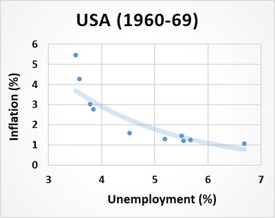
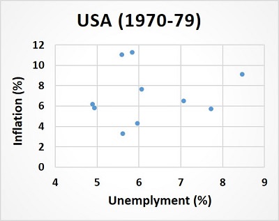
The tradeoff between inflation and unemployment is well represented by the 1960s as can be seen by the left side of the diagram above. A clear inverse relationship existed at this time and by the end of the 1960s, with unemployment levels really low and inflation hitting close to 6%, the turmoil of the 1970s would soon send policymakers into head-scratching mode!
The right side of the diagram shows that the inverse relationship of inflation and unemployment appears to have broken down in the 1970s. However, this is not entirely true, the relationship still existed but it had become obscured by the impact of oil price increases which caused economic costs of production to rise, and with it a huge contraction of production and employment i.e. Stagflation.
As well as supply-side factors influencing things, this period also saw the realization that inflation in the long-term could actually spiral ever upwards rather than being limited to some arbitrary higher rate.
Has Globalization affected the Phillips Curve?
So, we've established that the very high inflation rates of the 1970s caused the traditional trade-off between inflation and unemployment to become obscured by other factors. The theory tells us that this was because of a big change in inflationary expectations, but if that is all that has changed then how do we explain more recent events?
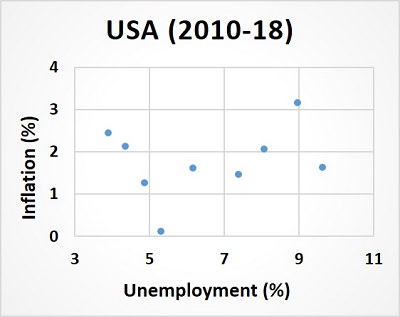
There had been no high inflation in modern times right up until 2020, meaning that inflationary expectations can be held more or less constant (given that those expectations are based on the actual levels of inflation in preceding years) and yet the downward sloping short-run Phillips curve is still very difficult to find.
My theory for this is that the Consumer Prices Index (CPI) is not a good measure for assessing whether an economy is over-performing or under-performing.
I do accept the principles of the Phillips curve, but the CPI appears to be a bad measure of domestic inflation now that globalization has led to so many supply-chains being based across national boundaries.
After decades of globalization, much of what goes into the CPI basket of measured goods are produced, either wholly or in part, in foreign lands. So much so that the basket as a whole is somewhat compromised as an indicator of domestic inflation. This problem is compounded by the fact that the best indicative domestic goods, e.g. house prices and real estate, are actually excluded from the CPI.
In other words, when unemployment is low these days, and consumer spending rises accordingly, the extra demand for products can more easily be satisfied by raising output levels without raising prices. The developing world, and China in particular, has so much spare capacity to increase output levels to satisfy any extra demand from the west that there is much less pressure for traded-good prices to increase when western world unemployment levels are low.
This, however, only applies to traded goods that can be produced overseas and shipped into the domestic economy. The prices of products that can only be made and sold within the economy e.g. housing and commercial buildings, local services like healthcare and education, and locally produced perishable goods like food and so on, will still rise as predicted by the short-run Phillips curve.
By way of example, consider this diagram that shows the relationship between house price inflation and unemployment in the years 2010-2018.
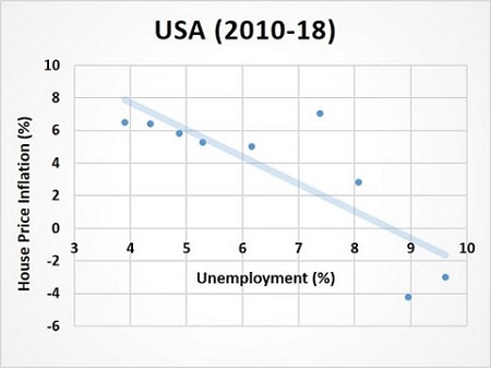
As you can see, there is still a clear trade-off between house price inflation and unemployment, a trade-off that was completely missed by the standard CPI measure of inflation.
Now, I am not suggesting that house-price inflation is a perfect tool for estimating whether or not an economy is overheating, but it certainly appears to have done a much better job than the CPI in recent decades.
If you need more convincing of this then you can read more about it on my page about the money-multiplier where I explain how money impacts on the business cycle.
Sources:
Related Pages:
About the Author
Steve Bain is an economics writer and analyst with a BSc in Economics and experience in regional economic development for UK local government agencies. He explains economic theory and policy through clear, accessible writing informed by both academic training and real-world work.
Read Steve’s full bio
Recent Articles
-
What Happens to House Prices in a Recession?
Jan 11, 26 03:13 AM
What happens to house prices in a recession? Learn how different recessions affect housing, why 2008 was unique, and how policy responses change home values. -
Does Government Spending Cause Inflation?
Jan 10, 26 06:01 AM
Does government spending cause inflation? See how waste, crowding out, and stimulus spending quietly push prices higher over time. -
What Happens to Interest Rates During a Recession
Jan 08, 26 05:31 PM
What happens to interest rates during a recession? Explore why rates often fall, when they don’t, and how inflation, policy, and markets interact. -
Circular Flow Diagram in Economics: How Money Flows
Jan 03, 26 04:57 AM
See how money flows through the economy using the circular flow diagram, and how spending, saving, and policy shape real economic outcomes. -
What Happens to House Prices During Stagflation?
Jan 02, 26 09:39 AM
Discover how house prices and real estate behave during stagflation, with historical examples and key factors shaping the housing market.