- Home
- Consumer Behavior
- Indifference Curve

The Indifference Curve Explained (With Graphs)
The Indifference Curve in economics represents a fundamental concept in the theory of consumer behavior, and it allows us to construct some simple models about how people choose to allocate their limited incomes in the market by choosing certain bundles of goods over available alternatives.
The most important related concept relates to the 'utility' gained from different bundles of goods and services i.e. the satisfaction that those products confer to the consumer. Different indifference curves represent different levels of utility, any given curve represents a constant level of utility.
Conceptually we can easily imagine how this would happen if we imagine a tradeoff between two goods. For any given level of satisfaction from consuming some quantity of both these goods, we can imagine that a reduction in quantity of one good can be offset by some increase in the quantity of the other good.
This might not always accurately portray reality, but that is not our intent. The idea is to construct a model that describes how consumers usually behave in the market in order that we can make general observations and predictions about how markets function. This being the case, I would remind the reader that the general underlying assumptions about consumer preferences apply to indifference curve analysis i.e., preferences are complete, transitive, and more is always better. For more info on why that is, see my main article about:
Indifference Curve Analysis
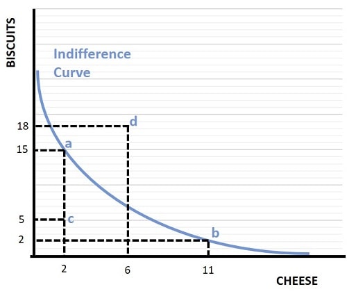
In the graph below I have illustrated a simple consumer indifference curve that represents an individual consumer's preferences for two goods e.g. cheese and biscuits.

As you can see, the curve is downward sloping indicating that a given level of utility is maintained with a negative relationship between these goods meaning that when consumption of either cheese or biscuits increases, utility is only held constant if consumption of the other good decreases. You should also note that the curve is convex to the origin, meaning that it bows inward. This relates to the important concept of diminishing marginal utility that I will describe a little later in the article.
By considering points a, b, c, and d in the graph we can begin to see why the indifference curve represents a given level of utility. Starting at point a, with a bundle of 15 servings of biscuits and 2 servings of cheese, we can deduce from the assumption that more is always better that point a offers more utility than point c, because point a yields the same amount of cheese but more biscuits. It follows from this that all points below the curve are inferior in terms of preferences, and that more consumer satisfaction (utility) can be obtained from consumption bundles on the curve than below it.
Now consider point d, which is above the curve. This point is preferred to points on the curve because it yields more of at least one good. In a world where we have an unlimited budget, consumers would prefer point d over any of the other points illustrated.
Next consider points a and b. Both of these points sit on the curve, meaning that the consumer is indifferent between these two bundles of goods. In other words, the consumer is equally satisfied with a combination of 2 servings of cheese and 15 servings of biscuits, as with 11 servings of cheese and 2 servings of biscuits.
We already know that point a is preferable to point c, because it comes with the same cheese but extra biscuits, but how does point b compare to point c? B has more cheese but fewer biscuits than c, so which is better? Well, we know that points a and b are equally preferred because they both sit on the same indifference curve. So, by the assumption of transitivity, since a is preferred to c, we can deduce the b must also be preferred to c. This further demonstrates that points under the curve are inferior to points on the curve.
Indifference Curves & The Indifference Map
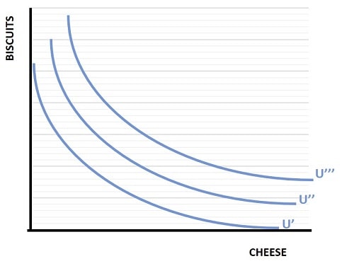
We now know that points on an indifference curve all offer the same amount of utility, it follows that points above or below a curve must sit on a different indifference curve. When we plot all combinations of goods for varying levels of utility we get multiple indifference curves. This is illustrated below, and the resulting graph is called an indifference map.
Since these curves each represent a given level of utility, it is typical in the standard economics textbooks to see these curves denoted with the letter U.

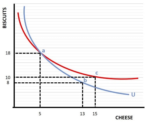
Note that each curve must always be higher or lower than another curve at all points. In other words, it is not possible for two or more curves to intersect each other. To see why this is the case, consider the graph below.

At point a, with 18 servings of biscuits and 5 servings of cheese, we know from the blue curve that the consumer is indifferent to point b with only 8 servings of biscuits but an increased 13 servings of cheese. Now, if the red curve was also an indifference curve, it would imply that the consumer is indifferent between point b and point c. Clearly this is not possible since it violates our assumption of non-satiation i.e., that more is always better, because point c has more of both goods than point b.
The only way to maintain our underlying assumptions about preferences from a diagrammatic perspective is to draw each curve as being higher or lower than another curve at all points, as illustrated by the 3 curves in the indifference map above.
The Slope of Indifference Curves
The slope of the indifference curve shows the relative tradeoff in the two-good model between biscuits and cheese. As you can see, as we move from left to right along a curve, its slope declines i.e., it gets flatter and flatter. This is a natural consequence of the law of diminishing marginal utility that I will describe in the next section. Before that, it's important to note that the indifference curve slope relates to the concept of the 'marginal rate of substitution'.
The marginal rate of substitution describes the tradeoff relationship between one good and another, and economists use it in a similar way to the marginal rate of transformation (a concept relating to the production possibilities curve). From an illustrative perspective, it is shown as a straight line tangent that touches the indifference curve point at the relevant tradeoff ratio between the two goods.
For further details about this important concept, and how it builds on our model of consumer behavior, see my article at:
Diminishing Marginal Utility
The slope of the indifference curve also indicates another important aspect of these curves, and that is the diminishing marginal utility that a consumer gets from an increased amount of a good. We do assume that utility can rise uniformly if we have enough money to keep moving to a higher curve, but for any given curve its convex shape shows that as we move along it we need an increasing amount of one good to compensate us for giving up a unit of the other good.
In other words, as consumption of one good increases relative to the other, the consumer gains diminishing marginal utility from it. At very high levels of consumption of one good relative to the other, we are prepared to sacrifice a large quantity of it in order to obtain an additional unit of the other good. Maximizing utility is the goal of any consumer, and you can learn more about this on my page about:
Consumer Income and Budget Constraint
If you have read this far you might reasonably be wondering why any consumer doesn't simply optimize their utility by choosing a bundle of goods with infinite quantities of both. The reason for that is because there has been no mention of the price of these goods or the role of money. All consumers, or almost all consumers, do of course face restrictions on their ability to consume as many goods as they would prefer to do if they had no budget constraint.
Since our level of income sets our budget constraint, it needs to be incorporated into our model of preferences in order to build a more complete picture. For full details and graphs on the budget effect on indifference curves, see my article at:
Related Pages:
- Marginal Utility
- Revealed Preference
- The Price Consumption Curve
- The Engel Curve & Income Consumption Curve
- The Income Effect
- The Substitution Effect
About the Author
Steve Bain is an economics writer and analyst with a BSc in Economics and experience in regional economic development for UK local government agencies. He explains economic theory and policy through clear, accessible writing informed by both academic training and real-world work.
Read Steve’s full bio
Recent Articles
-
What Happens to House Prices in a Recession?
Jan 11, 26 03:13 AM
What happens to house prices in a recession? Learn how different recessions affect housing, why 2008 was unique, and how policy responses change home values. -
Does Government Spending Cause Inflation?
Jan 10, 26 06:01 AM
Does government spending cause inflation? See how waste, crowding out, and stimulus spending quietly push prices higher over time. -
What Happens to Interest Rates During a Recession
Jan 08, 26 05:31 PM
What happens to interest rates during a recession? Explore why rates often fall, when they don’t, and how inflation, policy, and markets interact. -
Circular Flow Diagram in Economics: How Money Flows
Jan 03, 26 04:57 AM
See how money flows through the economy using the circular flow diagram, and how spending, saving, and policy shape real economic outcomes. -
What Happens to House Prices During Stagflation?
Jan 02, 26 09:39 AM
Discover how house prices and real estate behave during stagflation, with historical examples and key factors shaping the housing market.